It’s a grey day here outside (the whole sky is a grey cloud!) so we may as well continue our parade of timeless greys for inside which began here. You’ll discover paint colors to sample, interiors reflecting classic looks and neutral color stories, as well as unexpected combinations of cool and warm tones.
Timeless Greys to Try – Part 2
My Favorite Grey of the Moment
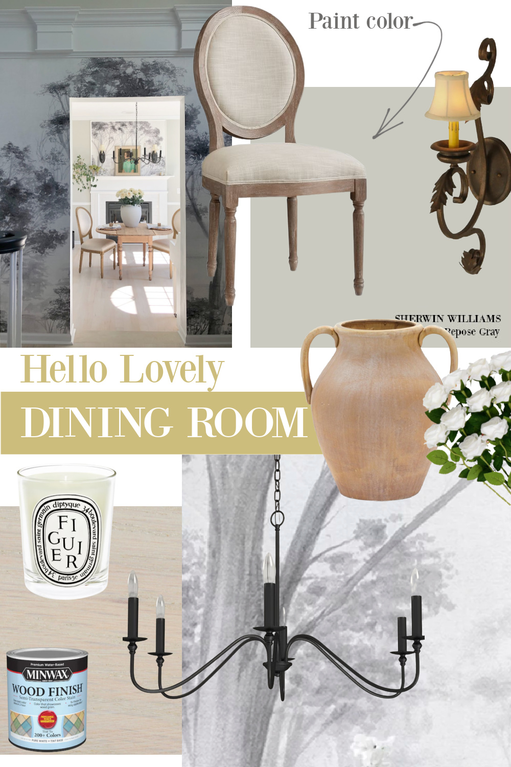
I’ll go into this color in more detail if you keep scrolling, but Repose Gray plays a prominent role in our current Georgian home. I bet it would read more blue-grey in regions where you get more of that gorgeous yellow sunlight, but here, it stays pretty consistent as the light changes through the day.
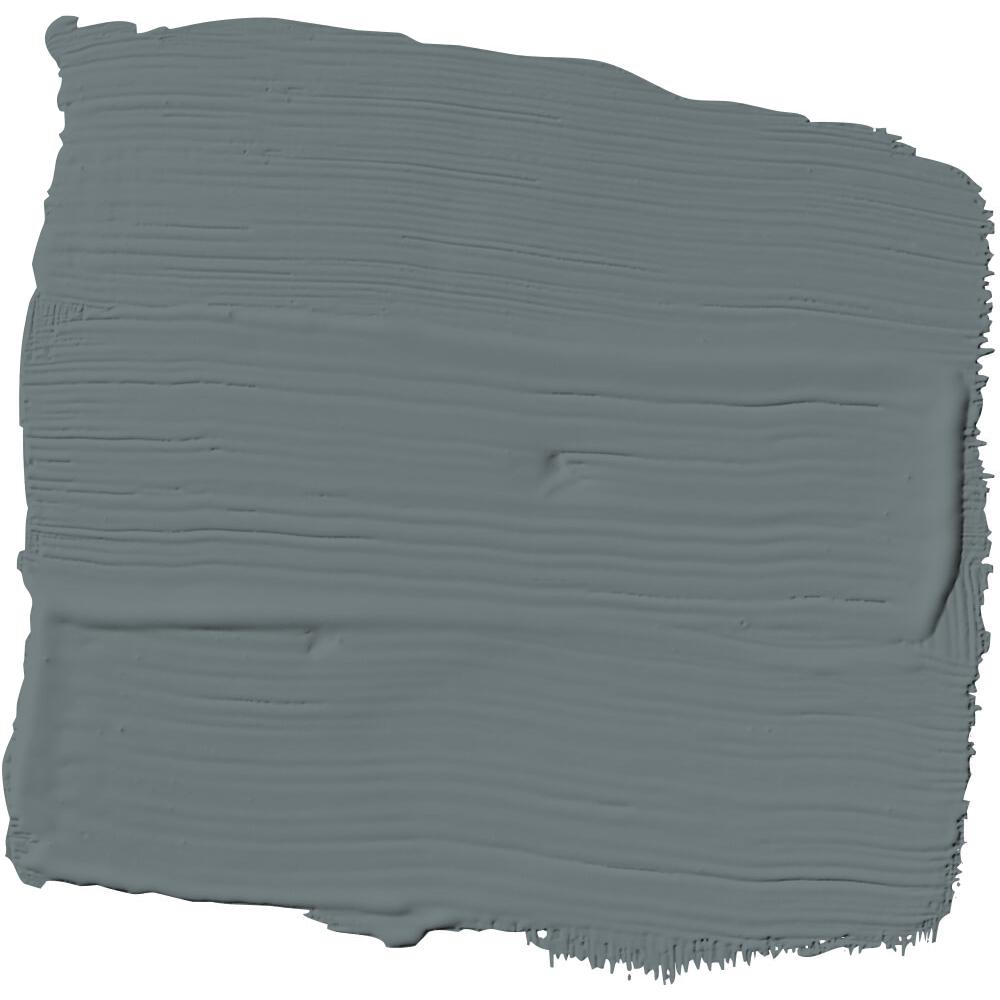
Sherwin Williams DORIAN GRAY: A Designer’s Favorite Timeless Grey
Have you noticed how a certain paint color surges in popularity as folks use it left and right because of the buzz? Dorian Gray seems to enjoy Swifty-eras-level glory!
It’s always interesting to note how a particular paint color reads in a photo, yes? Cabinets above seem very light. Not sure if the photo was edited, increasing the exposure or if natural light is washing out the color.

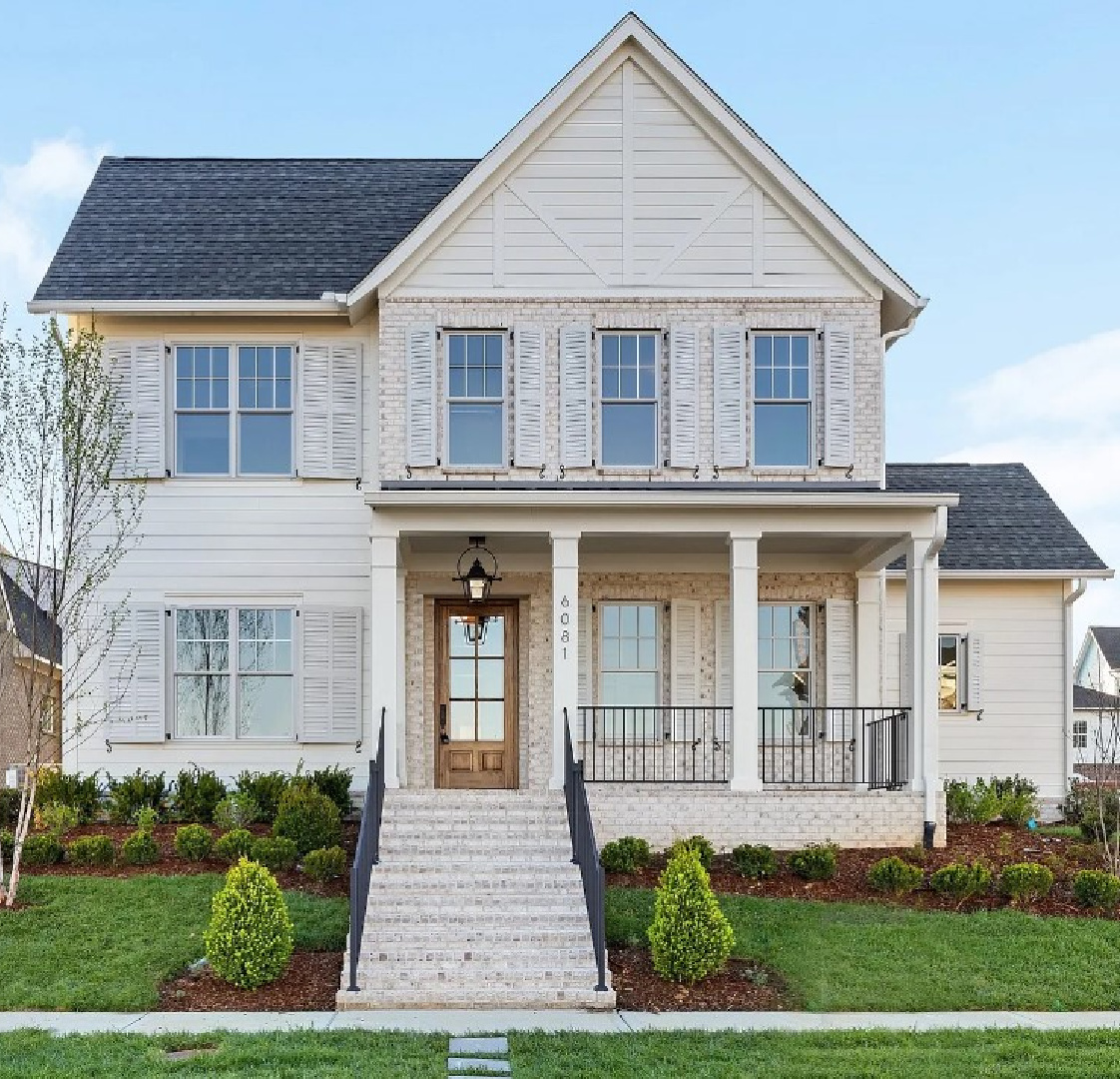
Here’s Dorian Gray on shutters and a front door:
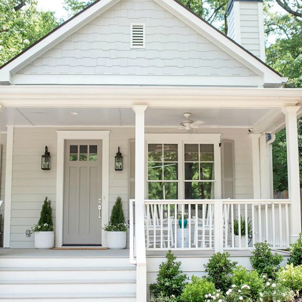
You definitely get a feel for its warmth when you compare it to Repose Gray which is on the siding of this home.
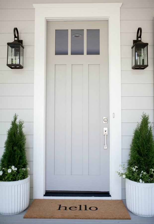
Sometimes what you want is low contrast between exterior trim, siding, and door color, and these two grey colors may be the combo you’re seeking.
Pale Grey Possibility: Benjamin Moore STONINGTON GRAY
I love how atmospheric, neutral, and balanced this cooler gray, BM Stonington Gray is – almost like a tranquil overcast day where you simply want to cozy on down with a book.

In this farmhouse with industrial farmhouse style, Stonington Gray feels modern and chic.
That’s something to consider when you are choosing colors for an older home. Certain tones are going to freshen the mood or even feel more youthful.

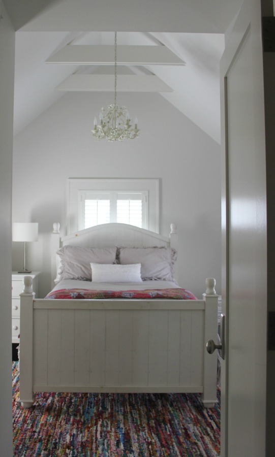
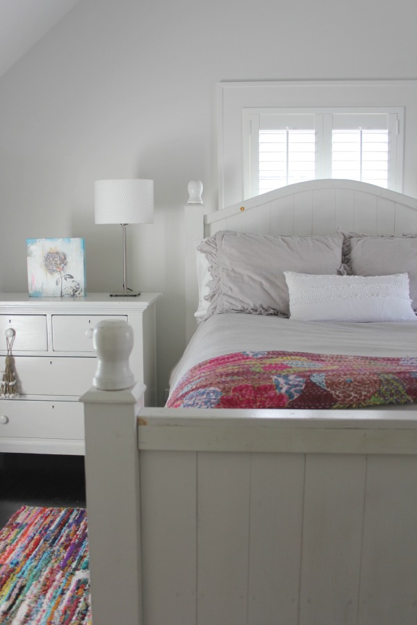
Grey colors are always a safe choice for bedrooms since most folks are after a restful, sanctuary, retreat-like feel.
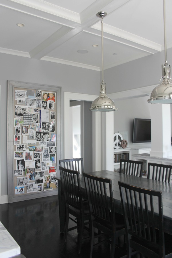
Grey in a kitchen or dining room? It has been a few years since I had a grey kitchen, and I would recommend sampling it on the wall to make sure it doesn’t bring down your mood or appetite. Certain colors will do that!

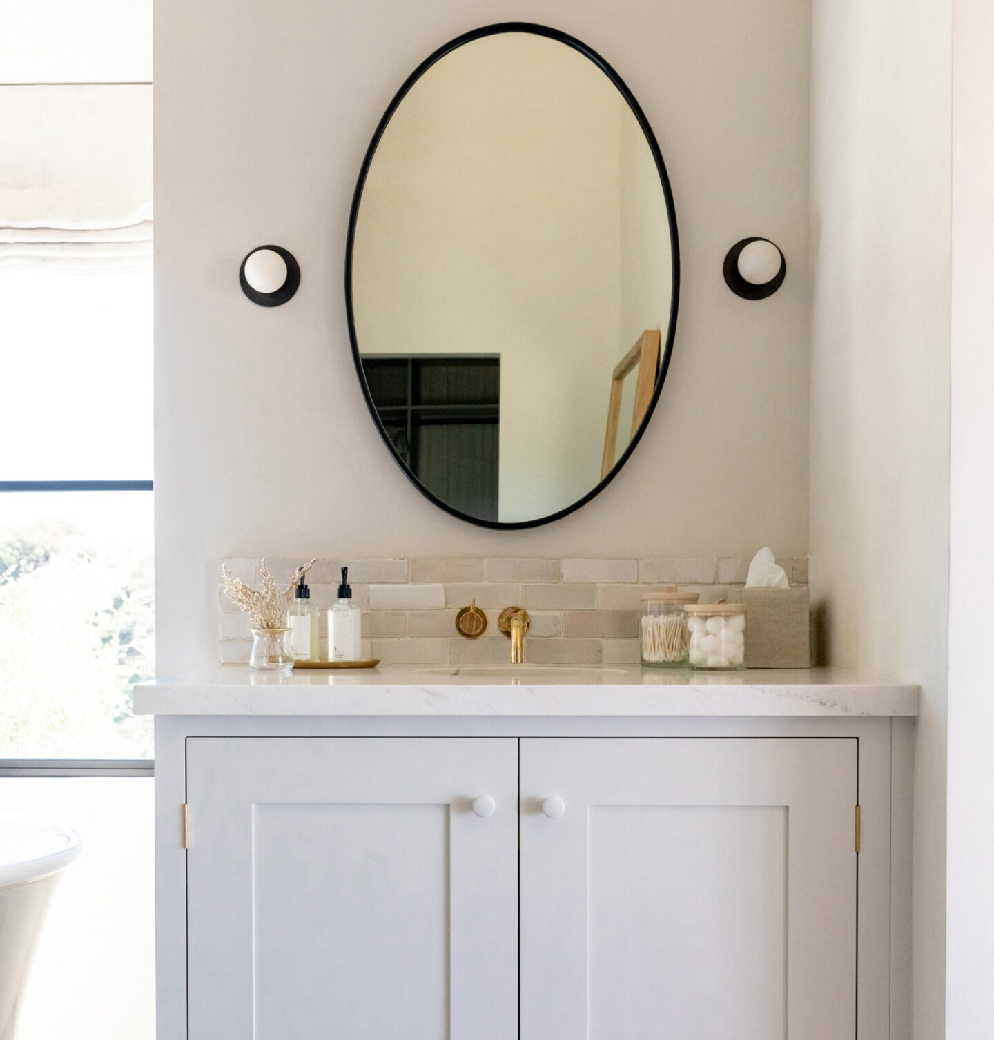
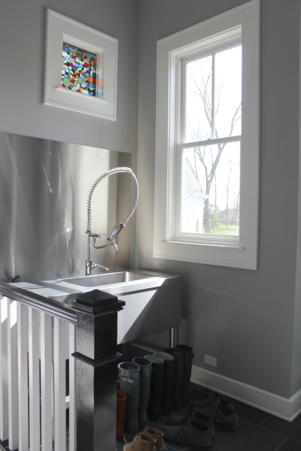
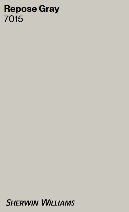
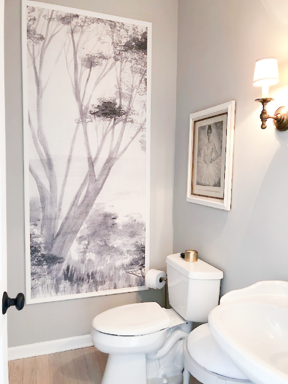
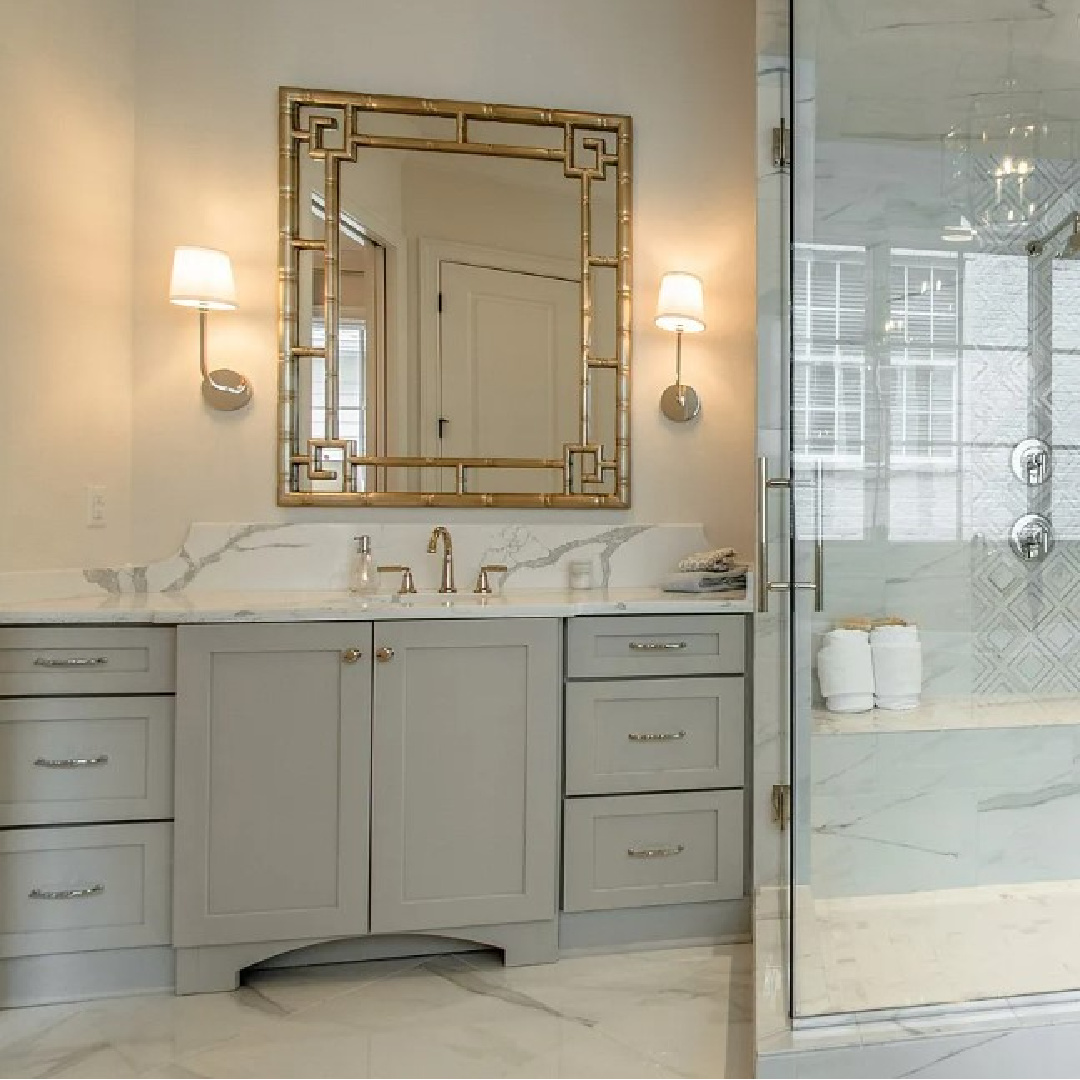
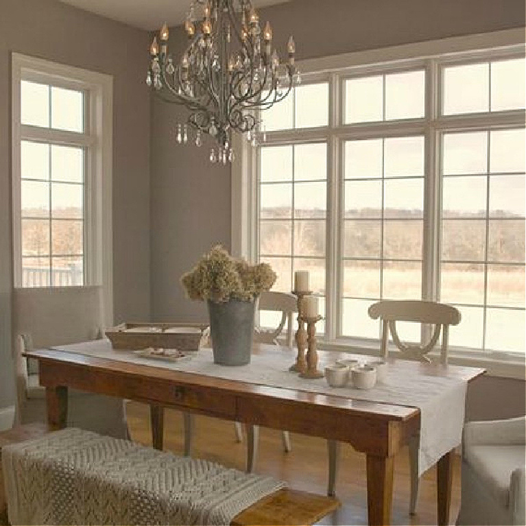
Sherwin Williams REPOSE GRAY
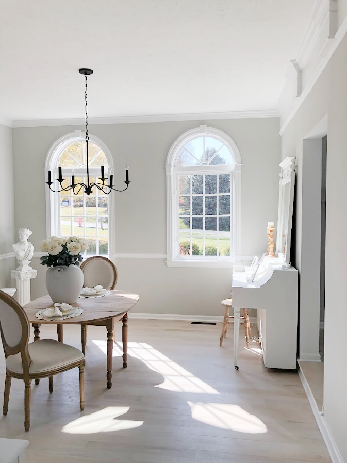
Repose Gray 7015 is a gorgeous, calming grey color that I love living with at home.
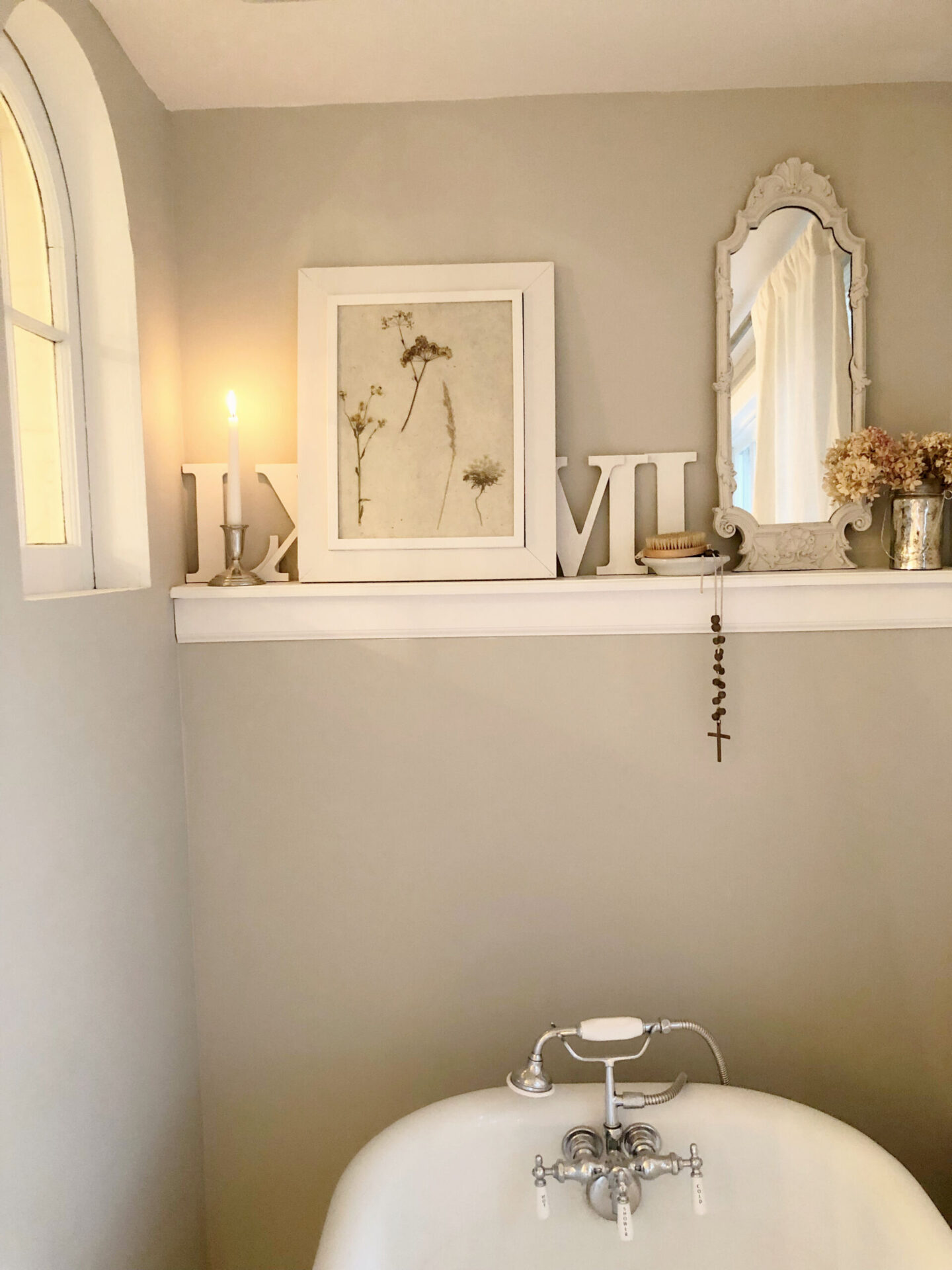
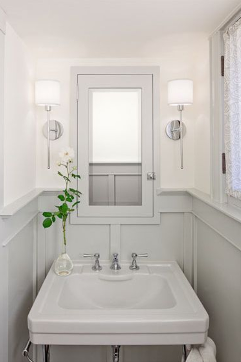
It is the wall color in most rooms on our main level as well as the color in our primary bath.
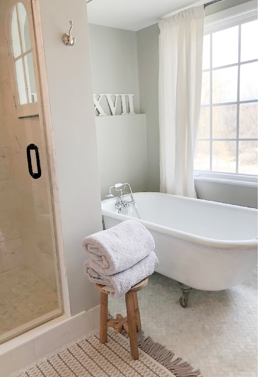
It’s cool and not too light but not too dark. In rooms with abundant natural light, the blue undertones seem to come forward which is lovely.
As mentioned earlier, it is quite similar to Farrow & Ball Pavilion Gray.
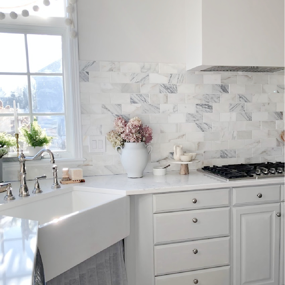
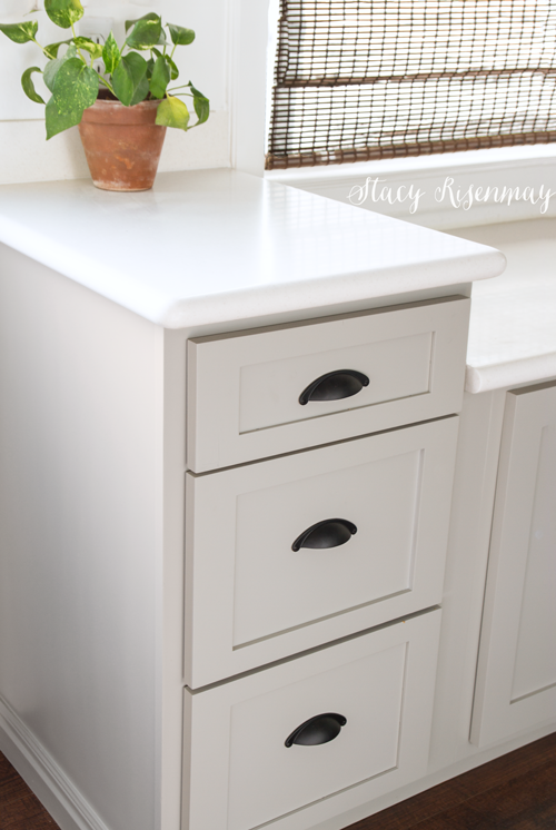
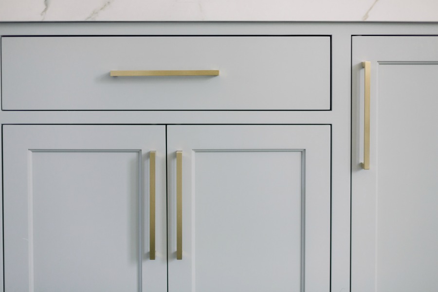
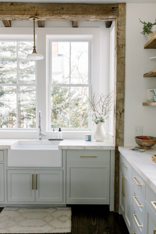
Here is Repose Gray on kitchen cabinets:
It has a soft quality about it, and unlike SW Agreeable Gray, it never seems beige to me.
But what if your room doesn’t get great light? Repose Gray may still be your grey.
In case you missed this Malibu home tour in part one:
As I watch how the color changes over the course of the day, I like it even at night.
I find that rather surprising given that where I live in Northern Illinois can be quite gloomy and grey outside. In our powder bath where there aren’t any windows at all, the color is still not too cool.
While Repose Gray is a cool grey, it is a great color for cabinets since it won’t feel cold or sterile.


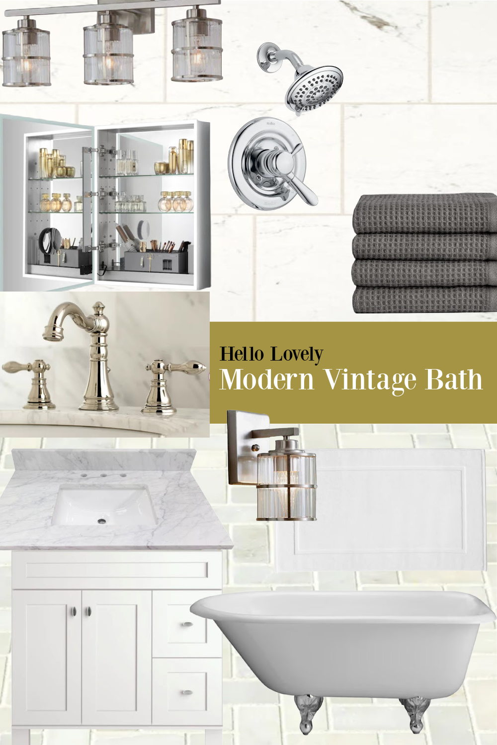
Design Tips for Choosing the Right Gray
1. Consider all the various nuances of light grey paint colors (is it cool, warm, bluish, mushroom-ish?).
2. Decide whether objects in the room are cool (choose a cool grey) or warm (choose a warm grey).

3. Assess the lighting in your space…does it receive a ton of natural light (go with a less pigmented hue) or very little sunlight (go with a more pigmented option).
4. Choose a few greys to test and compare.
But how many samples of grey?
Sample At Least 3 Colors
It is helpful to begin your search for the perfect light gray paint with at least three possibilities since the differences between them supplies you with valuable information.
It may be possible to consider one gray color at a time and then decide it’s all wrong or (yay!) perfect. But typically you need to view multiple tones in order to tease out what’s working and not working for you.
When you view three or more shades of grey in your space, it’s easier to identify undertones coming forward or how a color may feel too dirty, too green, too cool, or too brown.

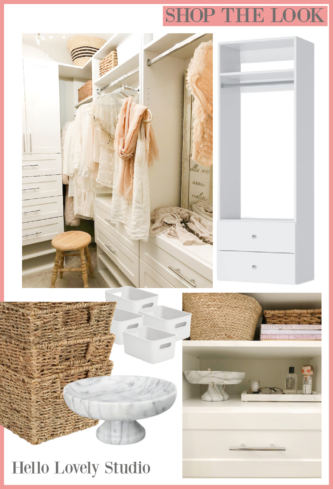
Psst. Our bedroom closet is SW Repose Gray. I know closet interiors are almost always painted white, but we wanted contrast with the white closet modules:
Craving a Moody Darker Grey?
OMG. I spied this shade of grey on a door in Leanne Ford’s IG (are you following me there?), and it’s gorgeous!
Peace to you right where you are.
-michele
Thanks for shopping RIGHT HERE to keep decor inspiration flowing on Hello Lovely!
Hello Lovely is a participant in the Amazon Services LLC Associates Program, an affiliate advertising program designed to provide a means for sites to earn fees by linking to Amazon.com and affiliated sites.